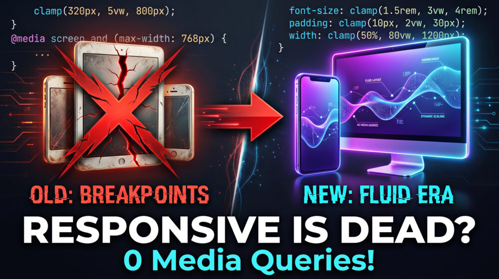
Responsive design is dead. This is how you build "Fluid" layouts that work on any screen size without a single Media Query.
For over a decade, web developers and UI/UX designers have worshipped at the altar of responsive design. We meticulously crafted our standard breakpoints mobile, tablet, desktop and felt a sense of accomplishment when a layout "snapped" into place as the browser window shrank.
But the web has outgrown the standard breakpoint.
Today, your users aren't just browsing on iPhones and standard laptops. They are opening your WordPress site on ultra-wide 49-inch curved monitors, incredibly narrow smartwatches, and a rapidly growing market of foldable smartphones where the screen size changes in real-time mid-scroll.
Managing five, six, or even seven media queries per page has become a bloated, slow, and fragile workflow. It leads to jagged, jarring design transitions and massive CSS files that drag down your Core Web Vitals.
Welcome to the era of Fluid Web Design. It's time to kill the breakpoint.
The Problem: Why 5+ Media Queries Are Killing Your Workflow
If you build websites, you know the headache of the "in-between" sizes. You set a breakpoint at 768px for tablets and 1024px for desktops. But what happens at 850px? Your layout doesn't break, but it doesn't look perfect, either. Typography feels slightly off-balance, and padding suddenly feels either too cramped or bizarrely hollow.
To fix this, developers historically added more media queries.
@media (min-width: 480px)@media (min-width: 600px)@media (min-width: 768px)@media (min-width: 1024px)@media (min-width: 1440px)
The result is a technical nightmare:
- Jagged Transitions: As a user resizes a window (or unfolds a screen), the layout violently snaps from one state to another.
- Code Bloat: Every media query requires duplicating CSS rules, increasing your file size and slowing down rendering.
- Maintenance Hell: Updating a single padding value means hunting down its variations across half a dozen viewport rules.
- Poor Performance: Excessive CSS calculation impacts your Interaction to Next Paint (INP) because the browser is constantly recalculating layout shifts.
What is the difference between Responsive Design and Fluid Design?
Responsive design uses CSS media queries to abruptly change the layout at specific screen widths (breakpoints). Fluid design uses advanced CSS functions like
clamp()and scalable units (likevworrem) to allow typography, spacing, and layouts to continuously and smoothly scale to fit any screen size, completely eliminating the need for media queries.
The Magic of CSS Clamp: True Fluidity
The foundation of the zero-breakpoint workflow is a single, incredibly powerful CSS function: clamp().
If you haven't integrated clamp() into your web design strategy, you are working harder than you need to. The clamp function takes three values: a minimum value, an ideal or preferred value (usually a dynamic viewport unit), and a maximum value.
Syntax: clamp(MIN, VAL, MAX);
Fluid Typography
Instead of writing four different font sizes for your H1 tags across different devices, you write one line of code:
CSS
h1 {
  font-size: clamp(2rem, 5vw + 1rem, 4rem);
}
- The Minimum (
2rem): The font will never shrink below this size, ensuring readability on tiny mobile screens. - The Preferred (
5vw + 1rem): The font will smoothly scale up and down based on the width of the viewport (vw). - The Maximum (
4rem): The font stops growing here, preventing your text from becoming comically massive on ultra-wide desktop monitors.
Fluid Spacing
This exact logic applies to padding, margins, and grid gaps. Instead of creating complex rules to tighten spacing on mobile, let the browser do the math:
CSS
.section-container {
  padding-inline: clamp(1.5rem, 5vw, 5rem);
  padding-block: clamp(3rem, 8vw, 8rem);
}
Your sections will naturally breathe on large screens and tuck in neatly on mobile devices. No snapping. No jagged layout shifts. Just pure, mathematical fluidity.
CSS Anchor Positioning API: Contextual Layouts Unbound
Fluid typography and spacing solve the element scaling problem, but what about complex layout relationships? Think of tooltips, popovers, dropdown menus, and contextual floating action buttons.
Historically, keeping a tooltip tethered to a button as the screen scaled required clunky JavaScript calculations, like getBoundingClientRect(), paired with heavy event listeners on window resize.
Enter the CSS Anchor Positioning API.
This cutting-edge CSS feature allows you to tether an absolutely positioned element (like a popover menu) to a specific "anchor" element dynamically, without a single line of JavaScript.
CSS
.button {
  anchor-name: --nav-button;
}

.tooltip {
  position: absolute;
  position-anchor: --nav-button;
  top: anchor(bottom);
  justify-self: anchor-center;
}
Why this is a game-changer for Fluid Design: When you build layouts with zero media queries, elements are constantly sliding, shrinking, and growing. Anchor Positioning ensures that dependent UI elements stick flawlessly to their targets regardless of how the viewport morphs. If a user opens a foldable phone and the grid shifts, your tooltips and menus natively reflow with the anchor, keeping your user interface perfectly intact.
Building a "Zero Media Query" Layout Architecture
Combining clamp(), modern CSS Grid, and Flexbox allows you to build complex pages that literally style themselves. It is the ultimate technical flex for a modern developer.
1. The RAM Pattern (Repeat, Auto, Minmax)
CSS Grid features an auto-placement algorithm that completely negates the need for mobile breakpoints.
CSS
.fluid-grid {
  display: grid;
  grid-template-columns: repeat(auto-fit, minmax(clamp(250px, 30vw, 350px), 1fr));
  gap: clamp(1rem, 3vw, 3rem);
}
How it works:
auto-fittells the browser to squeeze in as many columns as possible.minmax()dictates that a column can never be smaller than the calculated minimum, but can stretch to1fr(one fraction of the available space).- By placing a
clamp()inside theminmax(), we ensure the grid cards are perfectly sized for mobile, scale beautifully on tablets, and naturally form a multi-column layout on desktops.
Zero media queries required.
2. The Flex Wrap Trick
For navigational elements or tag lists, use flexbox with a dynamic gap.
CSS
.tag-list {
  display: flex;
  flex-wrap: wrap;
  gap: clamp(0.5rem, 1vw, 1.5rem);
}
The elements will gracefully wrap to the next line only when they physically run out of space, rather than forcing a layout change at an arbitrary 768px pixel mark.
WordPress Implementation: The Block Theme Advantage
For WordPress developers, the shift to fluid design couldn't have come at a better time. The days of heavy, bloated page builders that rely on pixel-perfect absolute positioning are ending. The future belongs to lightweight Block Themes that leverage the Site Editor (Gutenberg).
Modern block-based ecosystems are practically built for fluid design principles.
Utilizing theme.json
If you are developing a custom block theme or using advanced block frameworks, you don't even need to write the clamp() functions manually anymore. WordPress core now supports fluid typography natively via the theme.json file.
JSON
{
  "settings": {
    "typography": {
      "fluid": true,
      "fontSizes": [
        {
          "size": "1.125rem",
          "fluid": {
            "min": "1rem",
            "max": "1.5rem"
          },
          "slug": "normal",
          "name": "Normal"
        }
      ]
    }
  }
}
By toggling "fluid": true, WordPress automatically generates the complex clamp() CSS for every block on your site.
Lean Tooling
Themes and toolkits like Kadence and Blocksy are increasingly adopting fluid methodologies. Instead of manually adjusting margin toggles for Desktop, Tablet, and Mobile in the block editor sidebar, developers can set a fluid variable once. This results in incredibly clean, minimal DOM structures that load instantly, a critical factor for technical SEO and high-ranking user experiences.
Accessibility (WCAG 2.2) in a Fluid World
A common misconception is that heavily mathematical CSS creates accessibility hurdles. In reality, Fluid Design natively aligns with the latest Web Content Accessibility Guidelines (WCAG 2.2) better than rigid responsive layouts.
1. Reflow (WCAG 1.4.10): The guidelines require that content can be zoomed up to 400% without requiring two-dimensional (horizontal) scrolling. Because fluid layouts use relative units (vw, rem) and auto-fit grids, the layout naturally reflows vertically as the user increases their browser zoom.
2. Target Size Minimums (WCAG 2.5.8): WCAG 2.2 mandates that interactive targets (buttons, links) must be at least 24x24 CSS pixels. When using clamp() for button padding, you can ensure the minimum value never drops below accessible standards, even on the smallest smartwatch screens.
CSS
.accessible-btn {
  padding: clamp(12px, 2vw, 24px) clamp(24px, 4vw, 48px);
  min-height: 44px; /* Ensuring Apple/Android touch target guidelines */
}
3. Anchor Positioning and Focus Management: When using the Anchor API for dropdowns or tooltips, the DOM structure remains logical. You aren't hacking elements out of their natural document flow with JavaScript, which means screen readers can accurately interpret the relationship between the anchored element and the popover.
The SEO and Performance Edge
Let's talk about why this matters for your organic traffic. Search engines are obsessively focused on page experience. The Answer Engine Optimization (AEO) landscape requires lightning-fast content delivery to feed AI overviews and traditional search results.
Every kilobyte of CSS the browser has to parse delays the moment your user can interact with the page. By stripping out dozens of media queries, you drastically reduce CSS render-blocking time.
Furthermore, you eliminate layout thrashing. When a device rotates from portrait to landscape, a traditional responsive site has to discard its current CSS rules and paint an entirely new layout based on the next breakpoint. A fluid site simply recalculates the math natively. This leads to near-perfect scores in Cumulative Layout Shift (CLS) and Interaction to Next Paint (INP).
A faster, more stable site leads to a lower bounce rate, a higher dwell time, and ultimately, a higher click-through rate (CTR) on your search engine listings because Google rewards user satisfaction.
The Future is Fluid Web Design
The "Death to the Breakpoint" isn't just a catchy slogan; it is a fundamental shift in how we approach the canvas of the web. By adopting CSS clamp(), the Anchor Positioning API, and intelligent Grid behaviors, we stop dictating to devices how our designs should look. Instead, we give our layouts the mathematical intelligence to adapt beautifully to whatever canvas the user provides.
It’s leaner code, it’s a faster website, and it’s a vastly superior user experience.
Now, I want to hear from you. Are you still relying heavily on standard media queries for your WordPress builds, or have you started experimenting with clamp and fluid typography in your projects? Let me know your workflow in the comments below, and if you found this guide helpful, be sure to share it with a fellow developer who is tired of fighting with mobile breakpoints!