We live our lives bathed in the glow of pixels. From the moment the morning alarm rings on our smartphones to the final late night email sent from our laptops, our eyes are locked onto screens. For years, the tech industry’s primary answer to the resulting digital eye strain was simple: a toggle switch. Light mode for the day, dark mode for the night.
But as we navigate the dark mode evolution 2026, UI/UX designers and developers are realizing that a binary switch is no longer enough. The environments in which we use our devices are highly dynamic, a sunlit cafe, a dimly lit train carriage, a pitch-black bedroom. A static "dark mode" or "light mode" simply cannot account for the nuance of our physical surroundings.
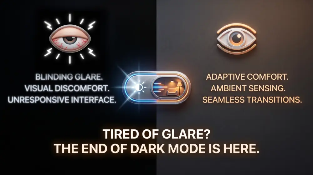
The solution lies in adaptive UI design: moving away from manual toggles and rigid themes toward intelligent interfaces that automatically detect ambient light and adjust contrast, saturation, and brightness in real-time.
Here is a deep dive into why we must move beyond the basic dark mode toggle, and how to implement true adaptive UI to prioritize user health and comfort.
The Problem with the Binary Toggle
Dark mode was a massive leap forward for UI design. By swapping glaring white backgrounds for deep grays and blacks, it saved battery life on OLED screens and provided much needed relief for our retinas in low-light environments.
However, the traditional dark mode comes with hidden usability flaws:
- The Halation Effect: When white text is placed on a pure black background, the text can appear to "bleed" or blur, especially for users with astigmatism. This forces the eye to work harder to focus, ironically increasing eye strain.
- Contextual Blindness: If you step out of a dark room into bright sunlight while your phone is stuck in dark mode, the screen becomes a mirror. The contrast ratio fails against the power of ambient glare.
- Friction in the UX: Forcing the user to manually dig into settings to flip a switch every time their environment changes is poor user experience. The best UI is invisible; it should do the work for the user.
Enter Adaptive UI Design: Context-Aware Interfaces
Adaptive UI design is the practice of creating interfaces that respond to the user's environment, device capabilities, and personal preferences without requiring manual input. In the context of eye strain, an adaptive UI doesn't just ask, "Is it day or night?" It asks, "How much light is currently hitting the screen, and what is the optimal contrast ratio for the human eye in this exact moment?"
By utilizing modern web standards and sensor APIs, we can create a fluid spectrum of themes rather than just two static options.
Static UI vs. Adaptive UI
| Feature | Static Dark/Light Mode | True Adaptive UI |
| Trigger | Manual toggle or fixed time of day. | Real-time ambient light and system settings. |
| Color Palette | Fixed hex codes for light and dark. | Fluid variables that adjust saturation and lightness. |
| Contrast | Standardized, regardless of the environment. | Dynamically scales up in bright light and down in the dark. |
| Typography | Fixed font weights. | Variable fonts that adjust weight based on background glare. |
The Foundation: CSS prefers-color-scheme
The journey toward adaptive UI begins with the foundational CSS media query: prefers-color-scheme. This query allows a website or web app to detect the user's system-level theme preference and adjust the UI accordingly.
Instead of building two entirely separate stylesheets, modern UI/UX design relies on CSS Custom Properties (variables) that swap their values based on this media query.
A Simple Implementation:
CSS
/* 1. Define the default (Light) theme variables */
:root {
  --bg-color: #f8f9fa;
  --text-primary: #212529;
  --text-secondary: #6c757d;
  --accent-color: #0d6efd;
  --surface-contrast: 10%;
}

/* 2. Intercept the system preference using prefers-color-scheme */
@media (prefers-color-scheme: dark) {
  :root {
    --bg-color: #121212; /* Note: Not pure black (#000000) to avoid halation */
    --text-primary: #e9ecef;
    --text-secondary: #adb5bd;
    /* Desaturate primary colors in dark mode to reduce optical vibration */
    --accent-color: #6ea8fe;
    --surface-contrast: 5%;
  }
}

/* 3. Apply the variables to your UI */
body {
  background-color: var(--bg-color);
  color: var(--text-primary);
  transition: background-color 0.3s ease, color 0.3s ease;
}
Why This Matters in 2026
In 2026, CSS prefers-color-scheme is no longer a "nice-to-have" feature; it is the absolute baseline of web accessibility. Search engines and browser algorithms actively favor sites that respect system preferences, meaning proper implementation is essentially an SEO and usability requirement.
However, relying only on prefers-color-scheme still leaves us tethered to a binary state. To build a truly adaptive UI, we must look deeper.
Moving Beyond: Contrast, Glare, and Ambient Light
To reduce eye strain entirely, we must address the nuances of human vision. The human eye does not just react to "dark" or "light" it reacts to contrast and glare.
Here is how modern adaptive UI tackles these challenges:
1. Utilizing prefers-contrast
Alongside color schemes, CSS offers the prefers-contrast media query. This detects if the user has requested the system to increase or decrease contrast (often an accessibility setting for visually impaired users).
CSS
@media (prefers-contrast: more) {
  :root {
    --text-primary: #000000;
    --bg-color: #ffffff;
    /* Maximize contrast boundaries */
    --border-thickness: 2px;
  }
}

@media (prefers-contrast: less) {
  :root {
    /* Soften the UI to reduce harsh glare for sensitive eyes */
    --text-primary: #4a4a4a;
    --bg-color: #f0f0f0;
  }
}
2. The Future is Here: Ambient Light Sensors
The true holy grail of adaptive UI design is real-time environmental awareness. Modern devices are packed with ambient light sensors (the same hardware that automatically adjusts your phone's screen brightness).
By leveraging the Ambient Light Sensor API (via JavaScript), developers can dynamically alter CSS variables based on the exact lux (light intensity) of the user's room.
- Direct Sunlight (10,000+ lux): The UI needs maximum contrast. Backgrounds should become starkly bright, and text should become pure black to fight screen glare.
- Office Lighting (500 lux): Standard light mode is optimal.
- Dim Room (50 lux): The UI shifts into a soft dark mode. Backgrounds turn to deep charcoal, and text dims to a soft, warm gray to prevent retinas from being blown out.
- Pitch Black (0-10 lux): The UI drops to minimal luminance. Blue light is heavily filtered out, shifting the entire interface to a warmer, amber-tinted spectrum.
Conceptual Implementation:
JavaScript
// Check if the Ambient Light Sensor API is supported
if ('AmbientLightSensor' in window) {
  const sensor = new AmbientLightSensor();

  sensor.addEventListener('reading', () => {
    const lux = sensor.illuminance;
    const root = document.documentElement;

    if (lux > 5000) {
      // High glare: Maximize contrast
      root.setAttribute('data-theme', 'high-glare');
    } else if (lux < 50) {
      // Low light: Enter soft dark mode
      root.setAttribute('data-theme', 'low-light');
    } else {
      // Normal light: Standard theme
      root.setAttribute('data-theme', 'standard');
    }
  });

  sensor.start();
}
Note: Accessing hardware sensors requires secure contexts (HTTPS) and explicit user permission due to privacy standards. Always provide a fallback.
UX/UI Best Practices for Adaptive Interfaces
When designing a UI that changes on the fly, developers and designers must work closely to ensure the transitions feel natural rather than jarring. Here are the core principles for designing adaptive interfaces in 2026:
Avoid Pure Black and Pure White
Pure white (#FFFFFF) on a glowing screen acts like a flashlight shining directly into the user's eyes. Pure black (#000000) causes the aforementioned halation effect with white text.
- Best Practice: Use off-whites (like
#FAFAFAor#F5F6F7) for light mode backgrounds. Use deep dark grays (like#121212or#1E1E1E) for dark mode backgrounds. This reduces the strain caused by extreme light emission.
Desaturate Colors in Dark Contexts
A vibrant, saturated brand color (like a bright neon blue or emergency red) might look fantastic on a white background. However, against a dark gray background, highly saturated colors visually vibrate, causing immediate eye fatigue.
- Best Practice: Create a secondary, desaturated color palette for low-light contexts. If your primary button is
#0055FFin bright light, soften it to#6699FFwhen the UI adapts to the dark.
Implement Variable Typography
Contrast isn't just about color; it’s also about the physical weight of the text. Light text on a dark background inherently looks thicker than dark text on a light background.
- Best Practice: Use Variable Fonts. When the UI shifts to a dark theme, use CSS to slightly reduce the
font-weight(e.g., from400to350). This keeps the typography looking visually consistent across all environments.
Animate the Transitions
If a user is browsing your site while walking through a tunnel on a train, the ambient light will fluctuate rapidly. If your UI aggressively snaps back and forth between light and dark themes, it will cause immense visual friction.
- Best Practice: Always use CSS transitions on your background and text colors. A
0.3s easeor0.5s lineartransition allows the UI to "breathe" into its new state, mimicking how the pupil of the human eye naturally dilates and constricts.
The Business Case for Adaptive UI
While the primary goal of adaptive UI is user health, the business benefits are undeniable. In an era where user retention is fiercely fought over, comfort is a competitive advantage.
- Increased Session Lengths: If an app does not cause eye strain, users will naturally spend more time using it.
- Lower Bounce Rates: A user opening a blindingly white website in a dark room is highly likely to immediately hit the "back" button. Adaptive UIs prevent this immediate bounce.
- Brand Perception: Implementing advanced features like ambient light detection signals to users that a brand is cutting-edge, empathetic, and detail oriented.
Conclusion: Designing for the Human Element
The dark mode evolution 2026 is not about aesthetics, it is about ergonomics. Just as industrial designers spent decades perfecting the lumbar support of office chairs, UI/UX designers must now perfect the optical comfort of our digital environments.
By utilizing CSS prefers-color-scheme, respecting contrast preferences, and venturing into the frontier of ambient light detection, we can stop treating dark mode as a novelty toggle. Instead, we can build adaptive UI design systems that act as a natural extension of the user's environment.
The future of UI design doesn't force the user to adapt to the screen. It forces the screen to adapt to the user, write your thoughts in the comments.
I’ve laid out the roadmap for the dark mode evolution of 2026, but the real test happens in your design files and codebases.
Are you still settling for a static binary toggle, or are you actively experimenting with prefers-contrast and ambient light sensors? What is the biggest technical or design hurdle stopping your team from building truly context-aware interfaces today?
Don't just read and scroll past-scroll down and drop your thoughts in the comments right now. Whether you completely agree that adaptive UI is the new standard or you think a simple dark mode toggle is perfectly fine, I want to hear your take. Let’s debate the future of digital accessibility below!