Remember when making your WordPress website "mobile-responsive" felt like a massive achievement? You added some CSS media queries, ensured your columns stacked neatly on top of each other, and called it a day.
Welcome to 2026. That approach is no longer enough.
Today, user expectations have drastically shifted. When a visitor lands on your website via their smartphone, they don't want a shrunken-down desktop site. They want an app. They expect lightning-fast load times, thumb-driven navigation, tactile haptic feedback, and the ability to browse content even when their internet connection drops.
Transitioning from "Mobile-Responsive" to "Mobile-Native" UX in 2026
In this comprehensive guide, we are going to explore the critical transition from basic responsive design to mobile-native WordPress UX design. We will cover how to convert WordPress to PWA 2026 standards, implement the haptic feedback web API, and design thumb-friendly navigation WordPress menus, all while adhering to the latest WCAG 2.2 accessibility guidelines.
Let’s dive into the future of mobile web development.
🎯 What is Mobile-Native UX Design? (And Why Responsive is Failing)
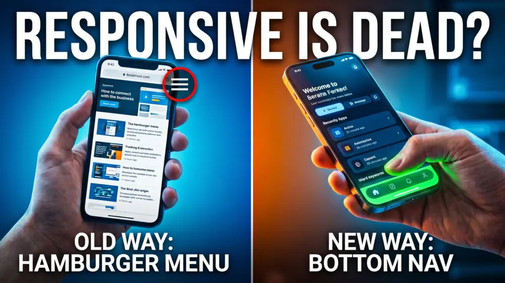
The Problem with "Responsive" Design
For over a decade, "responsive design" meant fluid grids. If a user was on a desktop, they saw three columns. On a tablet, two columns. On a phone, one long, stacked column.
While this solved the problem of content fitting on a screen, it completely ignored the ergonomics of how humans actually hold and interact with their devices. We forced users into a "desktop" state of mind on a mobile device. We hid essential navigation links inside tiny "hamburger" menus at the very top of the screen, the hardest place for a thumb to reach.
Enter Mobile-Native UX
Mobile-Native UX design means building a web experience that feels and functions exactly like a native iOS or Android application. It prioritizes the physical way people use their phones.
A true mobile-native web experience features:
- Thumb-driven "Bottom-Bar" Navigation: Putting the most important actions right under the user's thumb.
- Progressive Web App (PWA) Capabilities: Fast loading, home-screen installation, and offline caching.
- Hardware Interactions: Using device features like vibration for tactile feedback.
- Flawless Accessibility: Ensuring touch targets are large enough and focus states are visible, adhering strictly to WCAG 2.2 guidelines.
🛠️ Step 1: Designing Thumb-Friendly Navigation in WordPress
According to ergonomic studies, roughly 75% of smartphone interactions are thumb-driven. If your primary navigation is locked in a hamburger menu at the top-right corner of a 6.7-inch smartphone screen, you are actively frustrating your users.
To solve this, we need to implement thumb-friendly navigation WordPress users love: the Bottom-Bar Navigation.
How to Build a Bottom-Bar Menu in WordPress
You don't need a heavy page builder to achieve this. You can implement a sleek, app-like bottom navigation bar using your child theme.
1. Register the Menu in functions.php First, tell WordPress you want a new menu location specifically for mobile.
function register_mobile_bottom_menu() {
    register_nav_menu('mobile-bottom-bar', __('Mobile Bottom Bar', 'your-theme-domain'));
}
add_action('init', 'register_mobile_bottom_menu');
2. Output the Menu in footer.php Next, output this menu right before your closing </body> tag.
<?php if ( wp_is_mobile() ) : ?>
    <nav class="mobile-bottom-bar" aria-label="Mobile App Navigation">
        <?php
        wp_nav_menu(array(
            'theme_location' => 'mobile-bottom-bar',
            'container'      => false,
            'menu_class'     => 'bottom-bar-items',
            'depth'          => 1, // No dropdowns in bottom bars!
        ));
        ?>
    </nav>
<?php endif; ?>
3. Style it with CSS (and WCAG 2.2 in mind) We need to stick this menu to the bottom of the screen. Under the WCAG 2.2 Target Size (Minimum) rule, touch targets must be at least 24x24 CSS pixels, but for a true mobile-native feel, we should aim for the Apple recommended 44x44px minimum.
.mobile-bottom-bar {
    position: fixed;
    bottom: 0;
    left: 0;
    width: 100%;
    background-color: #ffffff;
    box-shadow: 0 -2px 10px rgba(0,0,0,0.1);
    z-index: 9999;
    /* Adding safe area padding for modern iPhones */
    padding-bottom: env(safe-area-inset-bottom);
}

.bottom-bar-items {
    display: flex;
    justify-content: space-around;
    list-style: none;
    margin: 0;
    padding: 0;
}

.bottom-bar-items li a {
    display: flex;
    flex-direction: column;
    align-items: center;
    justify-content: center;
    padding: 10px 0;
    font-size: 12px;
    color: #333;
    text-decoration: none;
    /* Ensuring WCAG compliance for touch targets */
    min-height: 48px;
    min-width: 48px;
}
Now, your site has a core element of mobile-native WordPress UX design. Your users can navigate your site one-handed while waiting for the train.
📱 Step 2: Integrating the Haptic Feedback Web API
One of the main reasons native apps feel so "premium" is tactile response. When you "like" a post on a native social media app, your phone gives a tiny physical click or vibration. It validates the user's action in a way visual changes simply cannot.
You can bring this exact functionality to your WordPress site using the haptic feedback web API.
Implementing Haptics on Buttons
The navigator.vibrate() method is widely supported on modern Android devices (iOS support via web browsers is historically restricted but evolving).
Here is how you can add a subtle vibration to your "Add to Cart", "Submit Form", or Bottom-Bar navigation buttons.
1. Create a JavaScript File (haptics.js)
document.addEventListener('DOMContentLoaded', () => {
    // Select all buttons you want to trigger haptics
    const hapticElements = document.querySelectorAll('.mobile-bottom-bar a, .add-to-cart-button, .wpforms-submit');

    hapticElements.forEach(element => {
        element.addEventListener('click', () => {
            // Check if the browser supports the Haptic Feedback Web API
            if ('vibrate' in navigator) {
                // A very short, crisp 50-millisecond vibration
                navigator.vibrate(50);
            }
        });
    });
});
2. Enqueue the Script in WordPress Add this to your functions.php to load the script cleanly.
function enqueue_haptic_script() {
    if ( wp_is_mobile() ) {
        wp_enqueue_script('haptic-js', get_template_directory_uri() . '/js/haptics.js', array(), '1.0', true);
    }
}
add_action('wp_enqueue_scripts', 'enqueue_haptic_script');
UX Best Practice: Never overdo haptics. A 50ms vibration feels like a satisfying physical click. A 500ms vibration feels like an annoying phone call. Use it sparingly to reward specific, intentional actions.
🚀 Step 3: Convert WordPress to PWA 2026 (Offline Functionality)
If a user loses internet connection while reading your blog on a train, a standard responsive website will show the dreaded "No Internet Connection" dinosaur game.
A Progressive Web App (PWA) handles this gracefully. By utilizing Service Workers, a PWA intercepts network requests, serves cached content, and allows your website to function offline. This is the ultimate step to convert WordPress to PWA 2026 standards.
The Two Pillars of a PWA
To turn WordPress into a PWA, you need two things:
- A Web App Manifest (
manifest.json): A JSON file that tells the browser how your web app should appear when installed on the user's home screen (icons, colors, display mode). - A Service Worker: A JavaScript file that runs in the background, managing caching and offline capabilities.
Method A: The Quick Way (Using Plugins)
If you are looking for rapid implementation, several plugins dominate the 2026 landscape. Plugins like SuperPWA or PWA for WP & AMP automatically generate your manifest file and register your service workers. They offer "Offline Fallback Pages" and simple cache controls right from your WordPress dashboard.
Method B: The Developer Way (Custom Service Worker)
Relying on plugins can sometimes bloat your site. Writing a custom service worker gives you absolute control over your caching strategy.
1. Create your sw.js (Service Worker) file in your root WordPress directory:
const CACHE_NAME = 'wp-pwa-cache-v1';
const OFFLINE_URL = '/offline-page/'; // Make sure you create this page in WP!

// Install event: cache the offline page
self.addEventListener('install', event => {
    event.waitUntil(
        caches.open(CACHE_NAME).then(cache => {
            return cache.add(new Request(OFFLINE_URL, { cache: 'reload' }));
        })
    );
});

// Fetch event: Network first, falling back to cache
self.addEventListener('fetch', event => {
    if (event.request.mode === 'navigate') {
        event.respondWith(
            fetch(event.request).catch(() => {
                return caches.open(CACHE_NAME).then(cache => {
                    return cache.match(OFFLINE_URL);
                });
            })
        );
    }
});
Register the Service Worker in your footer:
<script>
if ('serviceWorker' in navigator) {
    window.addEventListener('load', () => {
        navigator.serviceWorker.register('/sw.js')
            .then(registration => {
                console.log('ServiceWorker registered successfully.');
            })
            .catch(error => {
                console.log('ServiceWorker registration failed: ', error);
            });
    });
}
</script>
By implementing this, if a user clicks a link on your site while in a dead zone, instead of an error, they see your beautifully branded custom Offline Page, keeping them engaged within your app-like ecosystem.
♿ Accessibility First: WCAG 2.2 in a Mobile-Native World
As developers and designers, we cannot sacrifice inclusivity for aesthetics. When upgrading your site to a mobile-native experience, you must adhere strictly to WCAG 2.2 Guidelines.
Here are the critical checkpoints for your new app-like WordPress site:
- Focus Appearance (Success Criterion 2.4.11): When users navigate your new bottom bar using voice controls, keyboards, or switch devices, the active element must have a highly visible focus indicator with a high contrast ratio. Do not use
outline: none;without providing a custom, highly visible focus state. - Target Size (Success Criterion 2.5.8): As mentioned earlier, all interactive targets (like your bottom bar icons or haptic buttons) must be at least 24x24 CSS pixels. If they are smaller, there must be enough spacing around them to prevent accidental clicks.
- Redundant Entry (Success Criterion 3.3.7): If your PWA includes multi-step forms (like a mobile checkout), ensure users don't have to re-enter information they've already provided in a previous step. Use browser autocomplete attributes (
autocomplete="shipping street-address") extensively. - ARIA Labels: Because bottom bars often rely on icons rather than text to save space, you must include
aria-labelattributes on your links so screen readers can tell visually impaired users what the button actually does (e.g.,<a href="/cart" aria-label="View Shopping Cart">🛒</a>).
🏆 The Future is Native, Not Just Responsive
The era of merely squishing your desktop columns into a single mobile column is over. To compete in 2026, web developers must embrace the app-like mindset.
By implementing thumb-friendly navigation WordPress menus, you respect your users' ergonomics. By utilizing the haptic feedback web API, you provide premium, tactile validation. And by taking the steps to convert WordPress to PWA 2026 standards, you guarantee a fast, reliable, offline-capable experience that feels like it belongs natively on your user's smartphone screen.
This isn't just about design trends; it’s about answering the fundamental question of modern web development: How can we make the web feel flawless?
Over to You! 👇
We've covered a lot of ground today, from ergonomic thumb zones to writing custom service workers for WordPress. I want to hear from the developers and designers in the trenches: Which of these mobile-native features do you think makes the biggest impact on user retention, the Bottom-Bar Navigation or Offline PWA capabilities?
Drop your thoughts in the comments below, and if you found this guide helpful, please share it with your fellow developers on LinkedIn, Facebook or X (formerly Twitter)! Let's build a better, faster, mobile-native web together.