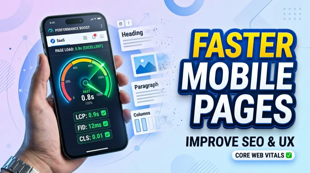
Modern websites must look perfect on every screen size. Visitors switch between smartphones, tablets, laptops, and large desktop monitors throughout the day. As a result, web designers and WordPress developers constantly face the challenge of creating layouts that adapt smoothly to different devices without sacrificing performance.
For years, many WordPress users relied on heavy page builders to control which sections appeared on specific devices. While these builders offered flexibility, they often introduced a hidden problem: large layout sections and asset-heavy content were still loaded in the background, even when hidden from visitors. This increased page size, slowed loading times, created unnecessary DOM elements, and frequently contributed to layout shifts.
WordPress 7.0 introduces an important improvement that addresses this issue directly. The new native Responsive Block Visibility system allows users to control the visibility of Gutenberg blocks across different screen sizes directly from the Block Editor. This gives developers and content creators more control over responsive design while helping improve performance and user experience.
In this guide, we will explore how the new feature works, why it matters, and how it can help you build faster, cleaner, and more responsive WordPress websites.
Why Responsive Design Matters More Than Ever
Responsive web design is no longer optional.
According to current web usage trends, mobile traffic accounts for the majority of website visits across many industries. Search engines prioritize mobile-friendly websites, and users expect seamless experiences regardless of the device they use.
When a website fails to adapt properly, several problems occur:
- Poor user experience
- Increased bounce rates
- Slower page loading
- Layout instability
- Lower search engine rankings
- Reduced conversions
This is why responsive design has become a fundamental part of modern WordPress development.
However, achieving responsive layouts efficiently has always been challenging.
The Hidden Problem with Traditional Page Builder Visibility Controls
Many page builders allow designers to hide sections on desktop, tablet, or mobile devices.
At first glance, this seems like the perfect solution.
Imagine creating:
- A large desktop hero section
- A simplified mobile hero section
- Different image galleries for desktop and mobile
- Separate navigation systems
The issue is that many page builders simply hide content using CSS.
The hidden content still exists in the page markup.
This means browsers may still:
- Parse unnecessary HTML
- Load extra JavaScript
- Process hidden elements
- Increase DOM size
- Waste memory and CPU resources
As websites become larger and more complex, these inefficiencies start affecting performance significantly.
The result is slower websites, lower Core Web Vitals scores, and frustrating layout shifts.
What Is Layout Shift and Why Should You Care?
Layout Shift occurs when page elements unexpectedly move while the page is loading.
This issue is measured through Google's Core Web Vitals metric called Cumulative Layout Shift (CLS).
A high CLS score can create poor user experiences.
For example:
A visitor tries to tap a button on their phone, but before the tap is completed, a hidden section loads and pushes the button downward.
The user accidentally clicks something else.
This creates frustration and often leads to abandoned sessions.
Search engines also consider layout stability as a ranking factor.
Reducing layout shifts helps improve:
- User satisfaction
- Accessibility
- SEO performance
- Conversion rates
- Mobile usability
This is where the new Responsive Block Visibility system becomes extremely valuable.
What Is the New Responsive Block Visibility System in WordPress 7.0?
The WordPress 7 native responsive block visibility feature introduces built-in controls that allow Gutenberg blocks to be displayed or hidden based on screen size.
Instead of relying on third-party page builders or custom CSS, users can now manage responsive visibility directly inside the Block Editor.
The feature is designed to support:
- Mobile-responsive block editing
- Device-specific layouts
- Cleaner markup
- Reduced DOM complexity
- Better responsive workflows
This means designers can create tailored experiences for different devices without introducing unnecessary page complexity.
How Responsive Block Visibility Works
The new system integrates directly into the Gutenberg editor.
When editing a block or group of blocks, users can configure visibility settings for different device categories.
Typical visibility options include:
- Mobile
- Tablet
- Desktop
This allows you to create layouts such as:
A compact call-to-action section for mobile users.
A more detailed promotional banner for desktop visitors.
A simplified navigation menu for smaller screens.
A fully featured navigation experience for larger displays.
The biggest advantage is that these controls are available natively inside WordPress.
No extra plugins.
No custom CSS hacks.
No dependency on bloated page builders.
Practical Example: Optimizing a Hero Section
Let's consider a common scenario.
A homepage contains a visually rich hero section with:
- Large background videos
- Multiple animations
- High-resolution imagery
- Interactive design elements
While this may look fantastic on desktop screens, it can create problems for mobile users.
Small screens do not need the same visual complexity.
Using WordPress 7 native responsive block visibility, you can create:
A desktop version with advanced visual effects.
A mobile version with optimized images and simplified content.
Each layout can be tailored specifically for its intended audience.
This results in:
- Faster loading
- Better readability
- Improved user experience
- Reduced layout shifts
How It Helps Minimize DOM Bloat
DOM bloat occurs when a webpage contains excessive HTML elements.
Large DOM structures force browsers to work harder.
Common symptoms include:
- Slower rendering
- Delayed interactions
- Higher memory usage
- Performance bottlenecks
Many page builders contribute to DOM bloat because they generate multiple nested containers, wrappers, and hidden elements.
The new responsive visibility controls help developers organize layouts more efficiently.
Instead of relying on complex workarounds, visibility can be managed directly at the block level.
This leads to cleaner page structures and more maintainable websites.
For developers focused on performance optimization, this is a significant improvement.
Benefits for SEO and Search Rankings
Website performance and SEO are closely connected.
Search engines evaluate several user experience signals, including:
- Mobile usability
- Page speed
- Core Web Vitals
- Layout stability
When responsive layouts are optimized correctly, websites often experience:
Faster rendering times, lower CLS scores, improved engagement metrics, and better overall user satisfaction.
The new layout shift optimization WP 7 capabilities make it easier for website owners to align their sites with Google's performance recommendations.
As a result, websites can become more competitive in search rankings.
Improved Mobile-Responsive Block Editing
One of the most exciting aspects of this update is how it simplifies the editing experience.
Previously, responsive design adjustments often required:
- Custom CSS
- Device preview plugins
- Third-party builders
- Theme modifications
Now, responsive decisions can be made directly inside Gutenberg.
This streamlines workflows for:
- Bloggers
- Content creators
- Freelancers
- Agencies
- Enterprise teams
The editing experience becomes more intuitive and accessible.
Even non-technical users can create responsive layouts without touching code.
Accessibility Considerations and WCAG 2.2 Best Practices
Accessibility should always remain a priority when implementing responsive layouts.
The new visibility controls are powerful, but they should be used thoughtfully.
According to WCAG 2.2 guidelines, content should remain:
- Perceivable
- Operable
- Understandable
- Robust
When hiding content on specific devices, ensure that important information is not removed from users who rely on assistive technologies.
Good accessibility practices include:
Providing consistent navigation across devices.
Maintaining logical content order.
Avoiding device-specific content that changes meaning.
Ensuring interactive elements remain accessible through keyboard navigation.
Testing layouts with screen readers.
Remember that responsive design should improve accessibility rather than create barriers.
Best Use Cases for Responsive Block Visibility
The new system is particularly useful for:
Hero Sections
Create device-specific hero experiences without overwhelming mobile users.
Navigation Menus
Show simplified navigation on small screens while preserving advanced menus for desktop users.
Promotional Banners
Display different marketing messages based on available screen space.
Media Galleries
Optimize image and video presentation for different devices.
Complex Layout Groups
Hide large content sections that are unnecessary on smaller screens.
Call-to-Action Areas
Present streamlined conversion-focused content on mobile devices.
These use cases help improve both performance and usability.
Common Questions About Responsive Block Visibility
What is WordPress 7 native responsive block visibility?
It is a built-in Gutenberg feature that allows users to control whether blocks appear on mobile, tablet, or desktop devices directly from the WordPress editor.
How does it improve website performance?
By reducing unnecessary layout complexity and helping developers create device-specific experiences more efficiently, it can contribute to cleaner page structures and better performance.
Does it replace page builders?
Not entirely. However, many websites may no longer need page builder visibility controls for basic responsive layout management.
Can it help Core Web Vitals?
Yes. When used properly, it can reduce layout instability, improve responsiveness, and contribute to better Core Web Vitals scores.
Is it beginner-friendly?
Absolutely. The feature is integrated into Gutenberg and designed to be accessible for users without coding experience.
What This Means for the Future of Gutenberg
WordPress has steadily moved toward making Gutenberg a complete site-building platform.
The introduction of responsive block visibility demonstrates a continued focus on:
- Performance
- Accessibility
- Native functionality
- User experience
- Reduced plugin dependency
As more responsive features become available directly inside the Block Editor, WordPress users can expect faster workflows and cleaner websites.
This evolution strengthens Gutenberg's position as a serious alternative to traditional page builders.
Final Thoughts
The new Responsive Block Visibility system in WordPress 7.0 represents a major step forward for responsive web design.
For years, developers have relied on page builders and custom CSS to manage device-specific content. While these methods worked, they often introduced unnecessary complexity, increased DOM size, and contributed to layout shift issues.
With native responsive block visibility, WordPress now provides a cleaner and more efficient solution directly within Gutenberg.
The result is better mobile-responsive block editing, improved layout shift optimization, cleaner markup, enhanced performance, and a more streamlined workflow for developers and content creators alike.
As websites continue to prioritize speed, accessibility, and user experience, this feature is likely to become an essential part of modern WordPress development.
What do you think about the new WordPress 7 native responsive block visibility feature? Have you already started using Gutenberg for responsive layouts, or do you still rely on page builders? Share your experience in the comments below, and don't forget to share this article with your friends, colleagues, and fellow WordPress enthusiasts.
